
Generative image tools have become very good at lighting, composition and overall “vibes”. However, they still often fumble something many brands, educators and product teams need: legible words. Anyone who has asked for a café menu, a street sign, a product label or a poster headline has likely seen the usual results—misspellings, melted letterforms, random glyphs, or text that’s technically present but difficult to read.
One of the more direct attempts to tackle this specific pain point is GLM‑Image, positioned by Z.ai as a “start here” model for doing words in pictures better—with examples and prompt patterns focused on posters, signage, UI-like layouts, and other text-forward graphics rather than purely illustrative art. Z.ai’s own overview highlights improved text rendering as a first-class goal, not a side benefit (GLM‑Image page).
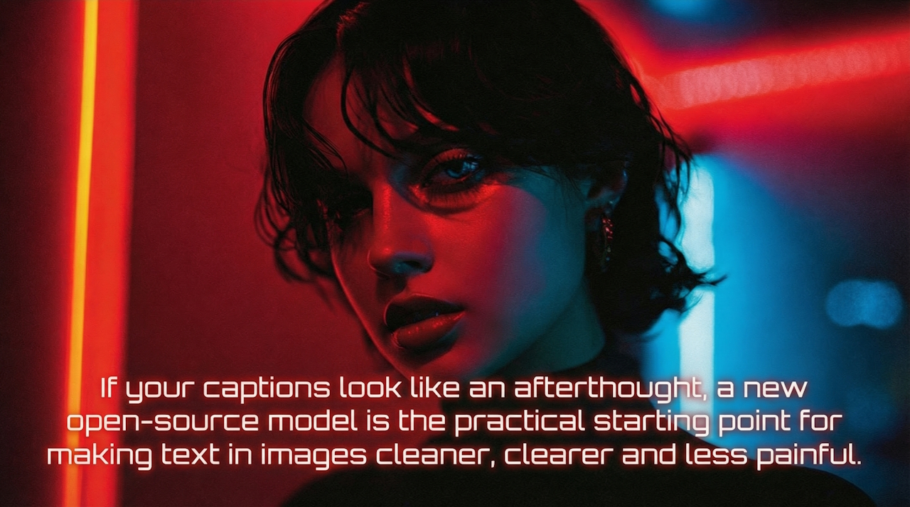
What follows is a practical, sourced guide to why text-in-image is hard, what “better” looks like, and how to more reliably get there—whether you’re using GLM‑Image or any comparable generator that claims stronger typography.
Why text still breaks in image generators
A commonly cited challenge is that many mainstream image generators are trained to produce pixels, not typography. They can mimic the appearance of letters in a broad statistical sense, but consistent spelling and clean letterforms require stable characters in a stable order, at a stable scale. Many diffusion systems also operate with intermediate latent representations that can prioritise overall semantics and texture over sharp, discrete edges—exactly what clean type needs.
In plain language, models may “know” what a sign looks like without “knowing” what it says. That gap can show up as letter swaps, extra strokes and plausible-looking nonsense (a phenomenon some writers compare to visual “hallucination”).
Research efforts aimed specifically at text rendering underline a similar point: it’s not always enough to prompt harder; the generation process may need mechanisms that preserve character structure and layout. For example, TextDiffuser frames diffusion models as “text painters”, proposing additional machinery to improve text fidelity in generated images (TextDiffuser paper). Even as general-purpose systems improve, text remains a common stress test because it demands precision at small scales.
What GLM‑Image is claiming (and what to look for)
Z.ai’s GLM‑Image pitch is narrow: better text rendering for practical creative and product tasks (posters, labels, signage, UI-like compositions), supported with prompt patterns and examples. The model page similarly frames it around these practical outputs, which is where many general image models tend to fail more visibly.
To judge any “better text” claim fairly, look beyond a single hero example. Useful checks include:
- Longer strings: short words can be lucky; paragraphs, menus and multi-line layouts reveal weaknesses quickly.
- Mixed content: a poster with a headline, subhead and fine print tests hierarchy and spacing.
- Non-Latin scripts: if you need multilingual output, test the scripts you actually use, not just English.
- Curved and perspective text: packaging and signage often require warping; many models degrade here.
It can also help to triangulate expectations against other systems that publicly document text improvements. OpenAI’s DALL·E 3 materials, for instance, describe improved text generation compared with earlier iterations as part of better prompt following, while also discussing limitations and safety constraints. The broader takeaway is that “better” is plausible, but rarely perfect—especially across fonts, languages and complex layouts.
Prompt like a layout designer, not a poet
If you want legible type, your prompt usually needs to behave less like creative writing and more like a mini design brief. Z.ai’s GLM‑Image guidance emphasises specifying the exact text and the context (poster, sign, label), which aligns with what often works across text-forward generators (GLM‑Image: prompt patterns and examples).
Practical prompt elements that often help:
- Exact copy, clearly delimited: put the text you want in quotes, and keep it final (avoid “something like…”).
- Role + medium: “a retail poster”, “a product label”, “a street sign”, “a landing-page hero” cues layout conventions.
- Hierarchy instructions: call out headline vs body size, alignment, and spacing: “large headline top-centre, smaller subheading below, fine print at bottom”.
- Typeface direction: instead of naming obscure fonts, describe attributes: “bold condensed sans”, “high-contrast serif”, “monospace UI label”.
- Background discipline: ask for “plain background behind text” or “high-contrast area for typography” to reduce texture eating your letterforms.
Typography references can also improve your own spec-writing. Google Fonts’ knowledge base is a useful refresher on what contributes to readability—hierarchy, spacing, x-height and contrast—so you can request the right properties rather than hoping the model guesses them (Google Fonts: Typography basics).
A useful mental model: you’re not just “asking for text”, you’re asking for a typographic system inside an image—where the text is allowed to be boring, clean and consistent.
Control the failure modes: spelling, kerning, and “almost right”
Even models that are strong on text can fail in predictable ways. Common “almost right” outputs include:
- Near-homophones and near-spellings (“cofee”, “c0ffee”, “coffe”)
- Duplicate letters and ghost strokes, especially in repeated characters
- Poor kerning (letters colliding or drifting)
- Microtype collapse: small print turns to noise
If your workflow allows it, a reliable production pattern is still: generate the image with space reserved for type, then add final text in a design tool. Many teams use this approach even when a model claims strong text rendering, because brand-critical copy (pricing, legal lines, names) often cannot be “close enough”.
However, when you do need the model to render final letters—such as for a mocked-up street sign, a UI screenshot concept, or stylised hand lettering—iterative prompting and selective complexity can help. Community guidance around Stable Diffusion, for example, often recommends keeping text short, increasing resolution, and simplifying backgrounds to improve readability. While GLM‑Image is positioned as more text-capable than baseline diffusion workflows, the underlying principle still tends to apply: reduce competing detail where the type has to survive.
A practical production check: zoom to 200–300% and scan for ambiguous characters (I/l/1, O/0, rn/m). If a reviewer hesitates, your audience may too—especially on mobile.
When “better text” changes who can ship work
The biggest impact of improved text rendering is not novelty; it can be speed. If a generator can reliably place a headline, price and call-to-action without corruption, some categories of work may move from “concept only” to “close to finish”: retail posters, event promos, quick-turn social tiles, packaging mock-ups, internal UI concepts, and education visuals.
This is where GLM‑Image’s focus may matter. A model that’s strong at cinematic imagery can still leave teams doing the fiddly parts manually. A model tuned for words-in-pictures may reduce the back-and-forth between “the AI made it pretty” and “design has to rebuild it from scratch”.
That said, it’s sensible to keep expectations grounded. Public-facing documentation from other vendors suggests text improvements are real but uneven; OpenAI’s DALL·E 3 documentation describes capability gains in prompt adherence and text while still framing these systems as probabilistic and fallible. Any organisation adopting text-forward generation should treat it as a productivity tool, not a guarantee—particularly for regulated copy or brand marks.
A practical checklist for cleaner text-in-image outputs
If you want a repeatable process (not just lucky generations), adopt a checklist you can run in minutes:
- Write final copy first: lock the words before you prompt.
- Specify layout explicitly: position, size, alignment, line breaks.
- Demand contrast: “high contrast between text and background” is not optional.
- Keep the background calm around text: gradients and textures are where letters can fail.
- Increase resolution where possible: small type needs more pixels to survive.
- Test edge cases: long words, all caps, mixed numerals, punctuation.
- Have a fallback: reserve space and typeset manually when accuracy is critical.
If you’re evaluating GLM‑Image specifically, start with the model’s own examples and prompt patterns, then stress-test with your worst-case real content (prices, SKUs, addresses, multilingual lines) rather than a feel-good poster headline.
In the end, “better words in pictures” isn’t about making AI do graphic design for you. It’s about reducing a frequent failure point—illegible type—so you can spend more time on hierarchy, message and taste. GLM‑Image is one signal that vendors are treating that pain more directly; whether it becomes your go-to tool will depend on how consistently it performs for your layouts, languages and production constraints.